How you present your products on the shelf can amplify sales. It’s a mix of basic shelf psychology, modern display solutions, and a bit of creativity.
If any bricks-and-mortar retail store wants to increase sales, part of the equation is using shelf space in the best possible way. For a long time, we’ve known that simply putting products on the shelf is the bare minimum; there’s so much science behind where, what, and how.
From the basic to the bold, we’ve got ideas that can give your shelving displays new life.
Empty Space on Shelves Deters Customers
Gaps on shelves give the impression that you’re not stocking shelves well. It also, rather conversely, makes other areas with product look jumbled and messy. Empty-looking shelves make people postpone purchases, purchase their items elsewhere, or buy online. An empty shelf can deter up to 46% of customers[1]. Fix this by:
- Rearranging items on the shelf to give the impression of fullness
- Make sure there’s space for new items and plenty of growth opportunities
- Paying attention to the data. How long are products on the shelf for? Which ones move fastest? Use AI to make sure you always have stock when you need it and avoid those gaps in supply
Light Up Your Product
Shops need to be well lit because it can result in higher customer spends. There are four main types of lighting to consider:
- Ambient- the general lighting around the store
- Accent – focuses on specific areas to bring awareness
- Decorative – optional lighting to make things prettier
- Task – functional lighting, for example, at the cash register
Done well, lighting should encourage people to buy; we know that bright lights make people more likely to impulse buy[1].
Consumers Like Order and Organization
People like to know where things are. Consumers have certain expectations of retail outlets, like deodorants are going to be in the same aisle as the soap, or chocolate is going to be close to the biscuits.
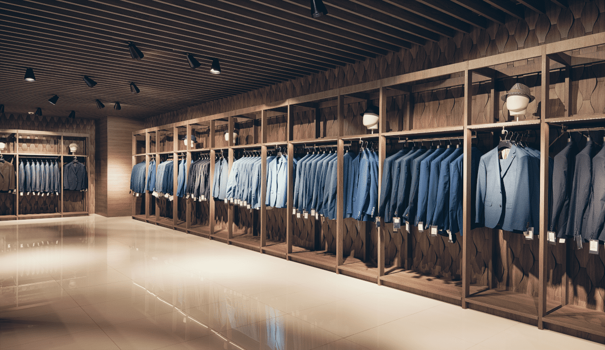
People also like order: labels to the front, products not shoved at the back of the shelf.
Disorganization is a sales killer, with about 50% of people[1] who had a negative experience with messy inventory or broken shelves walking away from a sale.
Keep your shelves organised and tidy using boxes and shelf dividers. Boxes comes in extra small, small, medium, large, and extra large. These boxes help you to create places for everything, and keep everything in the right place.
Another way to keep shelves looking well-arranged is with shelf dividers. Keeping products in nice tidy lines not only helps to ensure no chaos on the shelf, but also just looks nicer. If your shelves have variable depths, try using a breakable divider. These can be snapped to fit any size from 285mm to 485mm long. There’s two heights, 60mm or 120mm. You’ll also need to buy the appropriate T profile strip adhesive.
If the divider will be permanent, you could try these deli dividers, which could be adhered with double sided tape. They come in 100 x 500mm, 100 x 600mm, 100 x 700mm, and 100 x 800mm.
Also, it’s worth having employees educated on standards around front-facing labels. When items are stacked on the shelf, the labels should be facing the front. During general tidying throughout the day, staff should ensure products remain label-facing.
Things You Want to Sell Go at Eye Level
Whether this is an item that’s on sale, a new product, or the ultra-expensive eye cream that featured in some magazine last week, put it at eye level. This means it will be the first thing a customer will see, and we know customers are fickle and will always take the easiest and first option that presents itself.
Sort by Colour
While the whole chromatic ordering vibe isn’t for everyone or everything, it can be super effective. Seeing a whole shelf of one colour or a rainbow of products can be very enticing. It doesn’t make things easier to find, it doesn’t make any particular product the star, but it will draw the eye and slow customers down.
It’s likely something your competitors aren’t doing so can really set you apart. Some people are going to complain they can’t find what they want easily, but to the right customer, this could be fun.
Use Signage
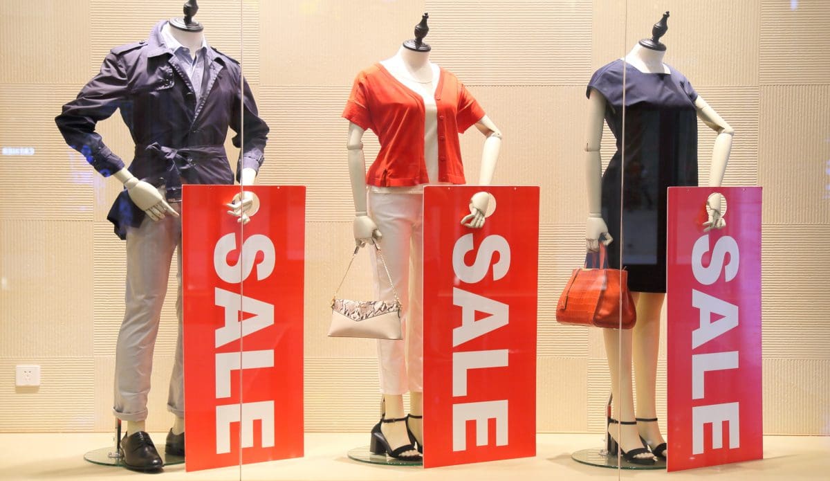
This isn’t groundbreaking; signage draws attention. But, different types of signage do different things.
- Wobblers/ danglers: These little signs pop off the shelf on a strip of plastic, and can draw attention to a product or item. These are common, but imagine seeing a line of these little guys wobbling in the breeze.
- Aisle violators: These are the large vertical signs that jut out into the aisle. These can be very effective for signs and directions, but also for a product or special offer.
- Shelf talkers: These can take a variety of forms, but are generally small-ish tickets that jut out of the shelf and draw attention to a product or maybe provide information. There are also ones that can be made to encompass an entire shelf area, include aisle violators, or even become a façade for a large area.
Need Shelf Dividers or Display Solutions?
In this push for pretty, don’t forget functionality. Keep products arranged logically, accessibly, and displayed effectively. We’ve been working in visual merchandising in NZ for years, and we know Kiwi customers, the products that can work, and we’ve probably got ideas that might help solve your display problems. Contact us to chat about your retail display options.
[1] https://nielseniq.com/global/en/insights/analysis/2022/empty-shelves-in-america-u-s-retailers-lost-over-82-billion-in-2021/
[1] https://www.ijsr.net/archive/v3i11/T0NUMTQxMTAy.pdf
[1] https://servicechannel.com/go/retail-report/

