Marketing psychology uses consumer biases, habits and psychological principles to answer the million-dollar sales question – what makes consumers choose your products over others?
While the fundamental purpose of good packaging is to protect the product, it also serves as an important point of communication between the brand and consumer. In fact, marketing teams use psychological principles in packaging design to draw consumers to their product in busy retail spaces.
Subtle cues like design, colour, shape and even typography could mean the difference between products collecting dust on a shelf and flying off them.
There are a few principles that are important to take into account for packaging design.
Use Colour to Connect with Your Customers
For many years, marketers have used the emotional resonance created by colours to sell their products. Colours have a powerful influence on people and therefore, are used in a variety of ways from being a communication tool to even influencing moods. In terms of packaging design, colours need to fill three key requirements:
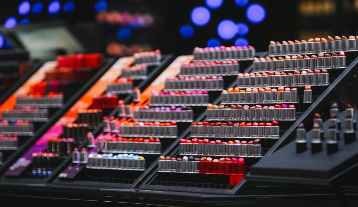
- Draw the customer’s eye: With so many products fighting for attention in a supermarket or a sales platform, the first step is getting people to notice yours, and science says you have less than two seconds to make an impact. Shades of red, pink, and yellow catch a person’s attention quicker than other colours. So, these are frequently used in packaging.
This means that your designs need to go one step further to stand out. This when designers employ the ‘isolation effect.’ This simply means that those designs that are different or ‘don’t belong’ to the same design style as the others, stand out.
- Create the right emotional associations: Certain colours are often connected with specific emotions. For example, blue connotes trust and red connotes love and yellow is a joyous colour. Choose colours that incite the emotions that you want associated with your products. Beware that connotations for colours change from one culture to the next and in different contexts.
- Reinforce your brand’s identity: Branding is the best way to ensure that repeat customers recognise your product the next time they see it. The colours of your logo or your brand identity should complement or contrast the colours you choose for your product.
Use Shape and Structure to Stand Out
Designing products with a distinctive packaging is an excellent way to stand out in a crowded marketplace. There isn’t a specific shape that appeals to all, but curves tend to be more favoured than straight edges. Depending on the product, pointed shapes are not preferred and sharp edges can be construed as threatening. While it is important to make the product’s shape stand out, it should also make sense for the product to be packaged a certain way.
Presentation of the Material
The materials you use in your packaging contributes to the overall design style and branding of your product. For instance, a wholesome, earth-friendly product that’s packaged largely in neon plastic gives the consumer contradictory messages. Or packaging an expensive perfume in corrugated cardboard, which connotes economy, doesn’t fit either.
Textures Add Interest
Once your product invites a customer to pick it up, it’s the right moment to add another layer of interest. Packaging that appeals to tactile sensations or touch makes a huge difference as well. Encouraging the customer to hold on to the product for even just a few seconds longer activates a sense of ownership and prompts consumers to take the product home.
Don’t forget to match the product to the texture. Because another aspect to consider is that in addition to the way textures make customers feel, what implications does the material carry? For an eco-friendly product, packaging that is raw and earthy fits well.
Typography Matters
Font styles, sizes and even placement all convey certain messages about your product and your brand. For instance, if you want to indicate a sense of prestige or old elegance, fonts with curving letters and scripts convey a sense of antiquity. Handscript fonts tend to give off a more playful and casual vibe while serif prints indicate stability and class.
Don’t Forget Quality and Convenience
While visual and tactile cues may get consumers interested in your product, quality and thoughtful design persuade them to buy your products again. Besides the visual interest of your packaging design, ensure that it is convenient to carry, open and use. A bottle that takes too long to open or is inconveniently bulky will dissuade a customer from buying it or from buying it a second time.
Think About the Environment
All businesses should be thinking about the most eco-positive packaging possible. This means that generally you should consider these points:
- Glass, as it is heavy to transport
- Overpackaging, as it adds twice the environmental burden
- Plastics that are not recyclable in NZ itself
- Plain clear or white plastic, as coloured is a barrier to recycling
Add information on the package to say the packaging is minimal intentionally and fully recyclable locally.
Design For Your Customers
Effective packaging design uses inherent customer biases to its advantage. While it’s important to know that colours, material and shape of packaging makes a difference to your design, it’s equally crucial to make the right choices for your customers. It pays to understand your customer base and their perceptions well. This way you can tailor your packaging to fit consumer habits and increase your products’ appeal. Contact us to chat about how you can combine packaging utility with excellent marketing strategies to make your product easier to sell.


